Brand identity | Packaging design | Print
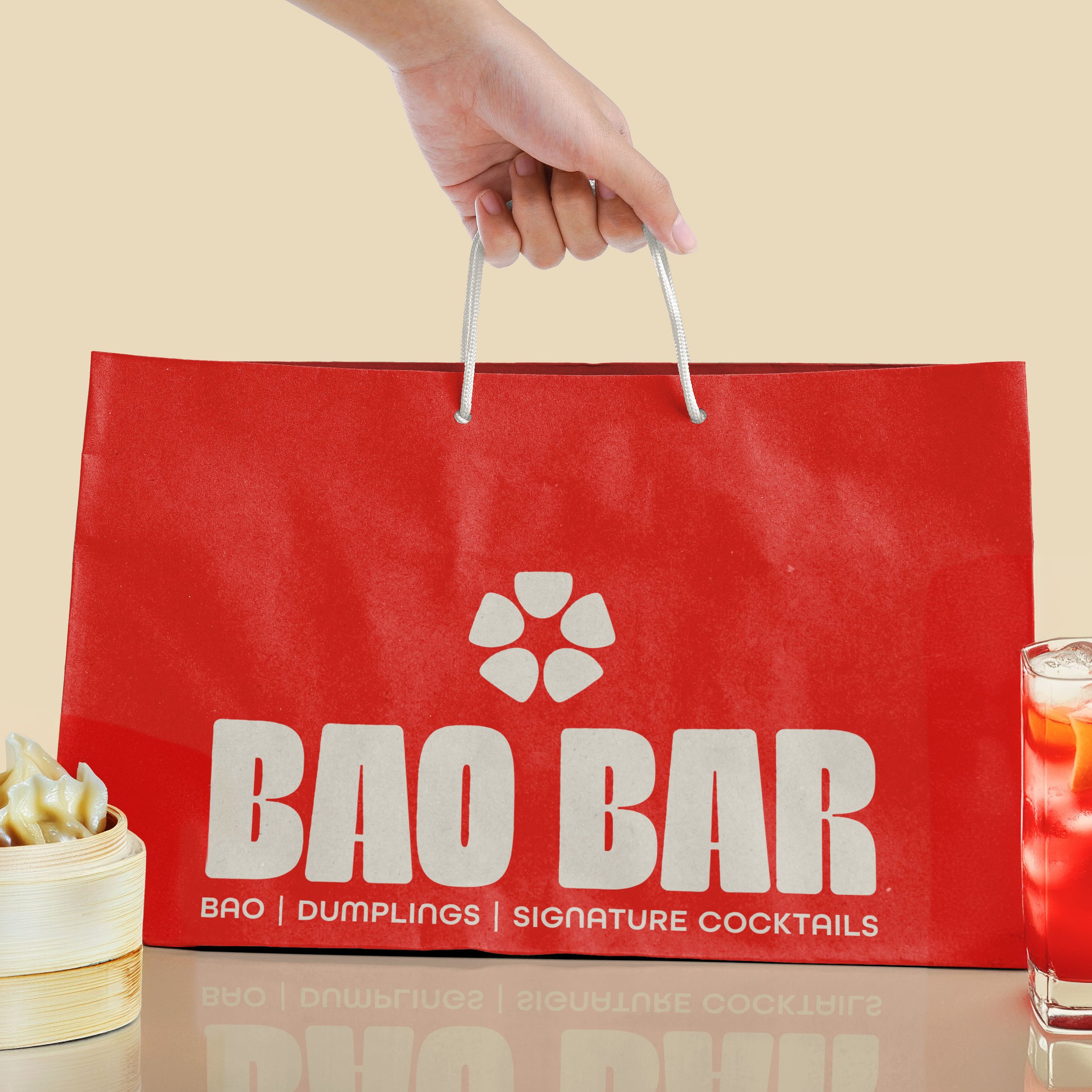
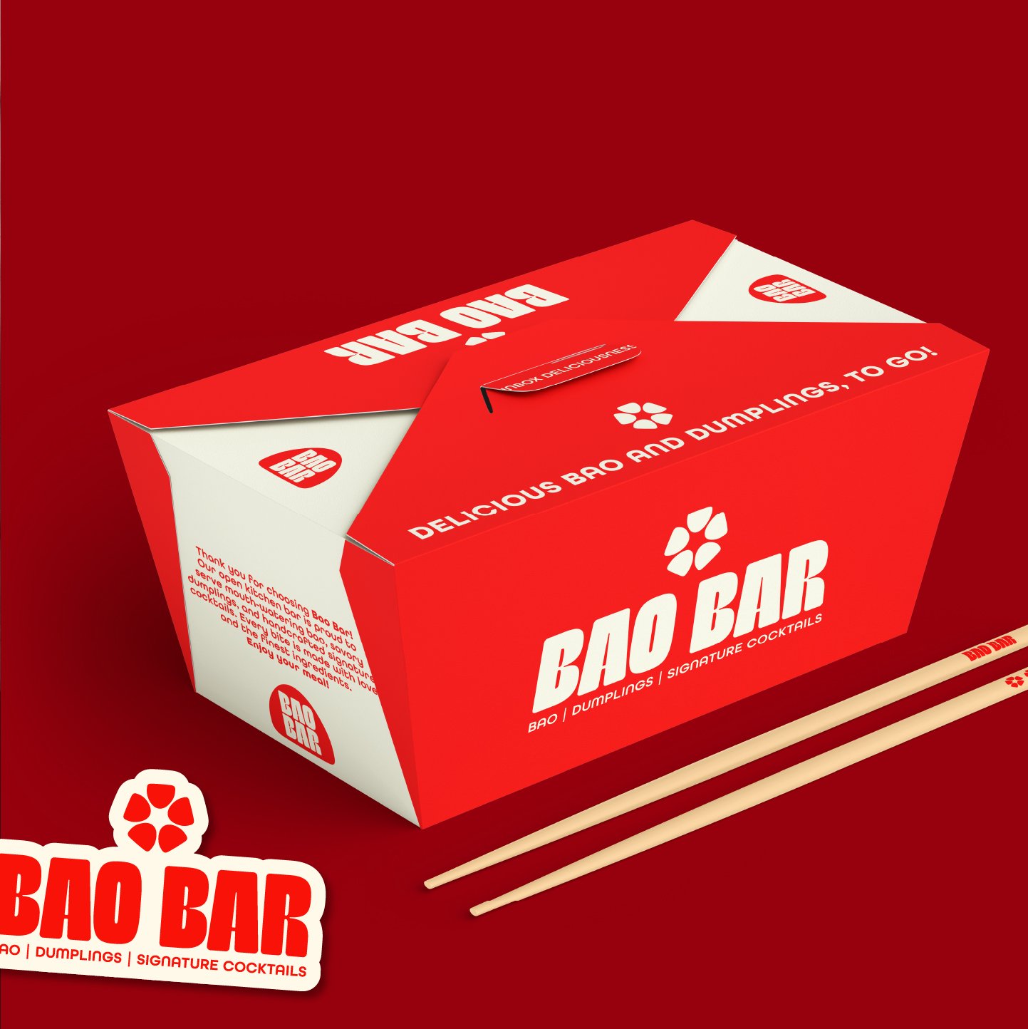
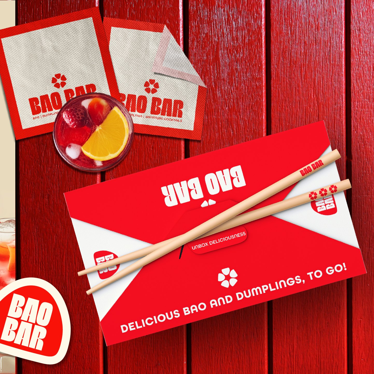
BAO BAR, a trendy open kitchen bar serving mouthwatering bao buns, dumplings, and signature cocktails, now looking to promote its takeout service.
BAO BAR
-
Inspired by a creative brief, I wanted to explore a bold, editorial direction for the restaurant. The simplicity of the name gave me the opportunity to build a more expressive identity around it, while also pushing myself into a design style I hadn't explored much before.
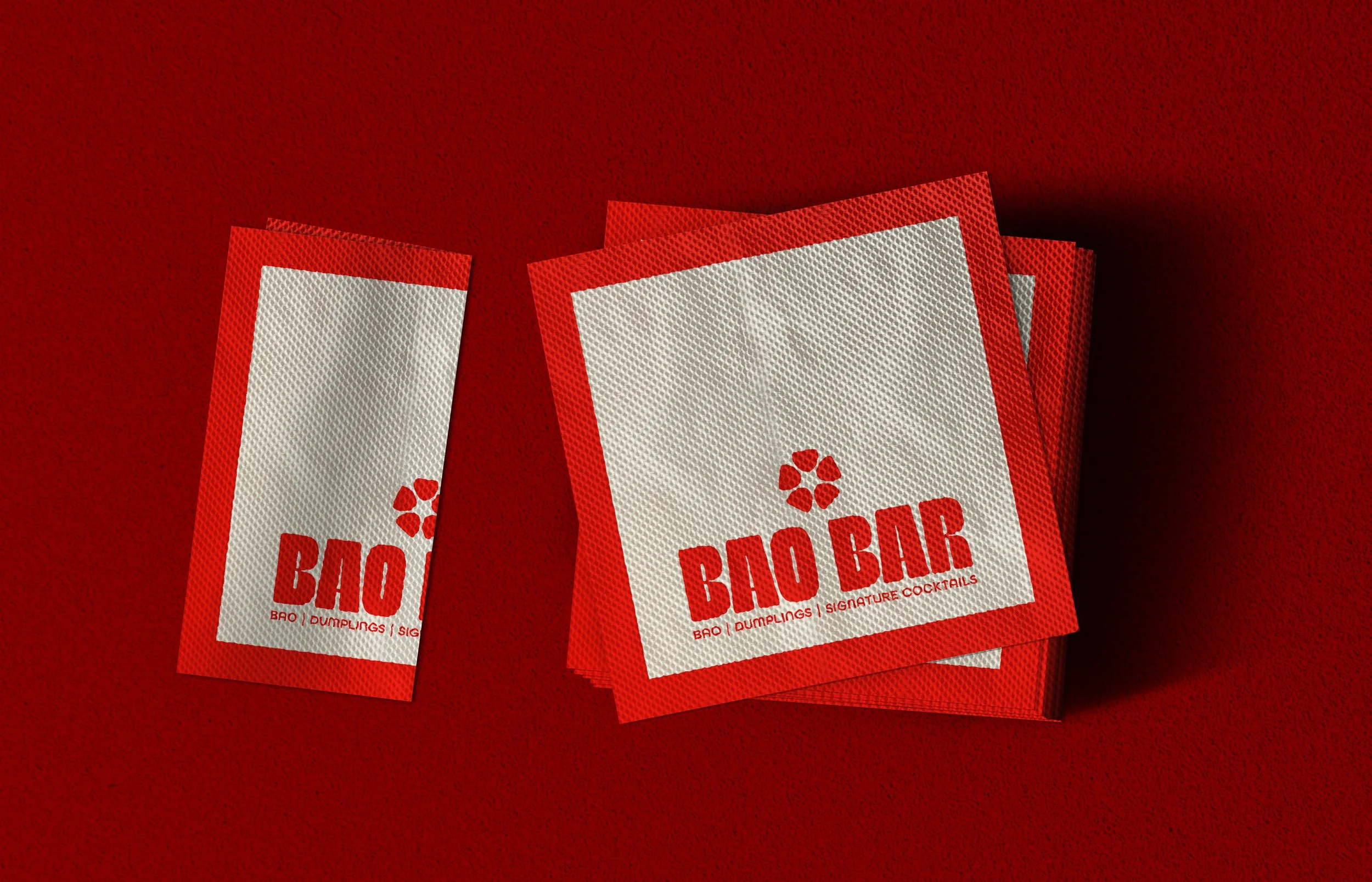
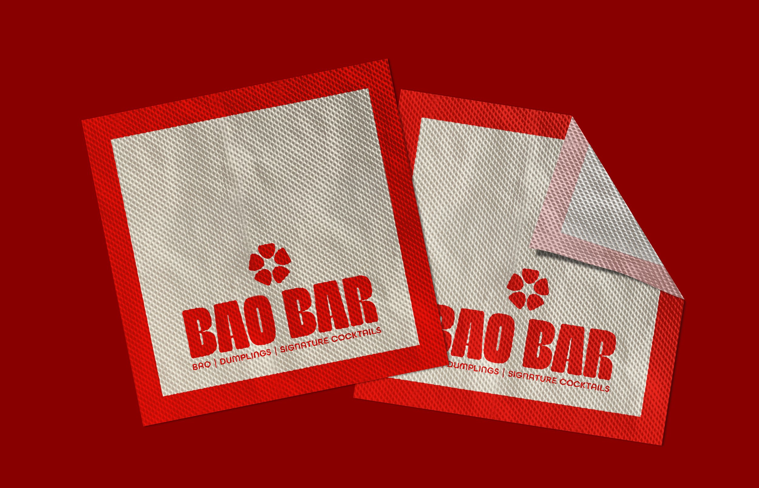
I always begin my branding process with the logo suite, and for this identity, it was the part I was most excited to develop. For the icon, I wanted to represent bao without reducing it to an overly simplified symbol. Five bao buns are arranged in a circle to mimic flower petals, creating a subtle visual connection to the form of a sakura flower. I paired the icon with a rounded sans serif typeface with a playful twist to give the identity a more modern personality, carrying that same rounded quality into the supporting typography.
For the color palette, I wanted to keep things intentionally limited, allowing one color to become immediately recognizable as the brand's visual signature. Red became the natural choice for its boldness and ability to stand out, while also drawing from its cultural associations with luck and good fortune.
The menu was the final and most important piece of the project. It was my first time working with print design and gave me the opportunity to see how the identity functioned across a larger application. With a large amount of copy to work with, my goal was to create a layout that remained both legible and visually engaging. While traditional Asian menus often rely heavily on food photography, I wanted to take a more simplified approach. Hand-drawn illustrations of cocktails, bao buns, and dumplings were introduced to break up the copy and add personality, ultimately bringing the menu and the overall identity together.